The Best Tie-Dye Color Combinations – Ultimate Guide
Fashion trends come and go, but tie-dye is among those frequently making a comeback. It is not only a fun pastime activity at camps and parties, or to kill boredom at home, but also turns an outfit from plain and boring into chic and vibrant.
The best thing about tie-dye is that it is pretty easy to master and inexpensive too. With the right dye, some plain tees, rubber bands, and a dash of creativity, anyone can pull it off. But occasionally, with a few beginners flops.
Unfortunately for newbies, sometimes the results end up being more drab than fab. And most of these unpleasant tie-dye outcomes have everything to do with pairing colors that don’t blend well.
So, what are the best tie-dye color combinations? The best tie-dye combinations are made with two primary colors. Colors adjacent to each other on the color wheel blend nicely as well. If you are planning on using more than two or three colors, just make sure you don’t place them next to their complementary color.
If you are aiming for camera-worthy tie-dye crafts, you must be looking for fun tie-dye color combos to try. This post is the best place to learn all about color mixing as we tell you what tie-dye colors look good together, plus what color combinations to avoid.
Understanding Tie-Dye Color Basics

Rushing to tie-dye your new or upcycled top, canvas bag, scarf, or whatever apparel before knowing your colors is like putting the cart before the horse. Ask any tie-dye expert and they’ll probably have a story of failure from back when they were starting out.
You combine a couple of your favorite colors hoping to make the funkiest and most unique tie-dye, only for the results to have you in tears. Instead of a brilliant splash of colors, you rinse out your tie-dye shirt to reveal dull brown spots all over it.
So what usually happens here? Well, it’s just a color combination gone wrong. The best way to understand tie-dye color combinations is to first get down the basics of color; what it is and how it is created.
Dye colors are basically a reflection of the different wavelengths of light. Light consists of these different colors but our eyes can only perceive a fraction of the spectrum from a surface.
The full spectrum of light is seen as white when reflected and black when absorbed by an object. But when it is separated into wavelengths, for example through a glass prism or water, we see all its colors. What this means is that the colors we see are of the wavelength an object reflects to our eyes after having subtracted the others.
When mixing dyes, you only need the three primary colors to create new colors. Two primary colors can yield any other color depending on the ratio of color to color.
The traditional primary colors you probably learned in school are red, blue, and yellow. However, for the dye makers, it is cyan, magenta, and yellow. This is the subtractive system whereby the surface subtracts certain wavelengths to show particular colors.
Therefore you might find fuschia, turquoise, and lemon being the primary colors in some dye brands while red, blue, and yellow are the primary colors in another. It all depends on the brand!
If color mixing seems confusing, you can use premixed tie-dye colors or dyes which come in various shades and tints. Even so, the knowledge of basic color mixing is still critical in color placement.
When tie-dying, the dyes tend to overlap sections. There’s astounding beauty in this, but also a great risk of ruining the design you envisioned if the colors don’t blend beautifully.
Any two primary colors in equal or varying portions will yield secondary colors. So you can always mix or place these side by side. Even if they run into each other, they produce something wonderful.
However, mixing certain colors can lead to brown or black coloration, so your tie-dye piece looks more like it fell on a muddy puddle rather than stunning artwork. Let’s find out which color combos work and which ones don’t.
Single Color Tie-Dye
The more colors you incorporate in tie-dye, the higher your chances of an epic fail. This, of course, is not a problem if you already mastered your tie-dye game.
However, it is normal for newbies to be over-enthusiastic with colors only for the end result to turn out unpleasant. If this is your maiden tie-dye project, it is best to play safe by starting with a single color tie-dye. Sometimes less is more and the simplicity of one color can turn out super chic with the right pattern.
Any one of your favorite colors will turn out super interesting on a white background in swirls, stripes, or whichever design you have in mind. If you would like a little bit more color without the risk of a second dye, go with pastel tees as opposed to white.
White is preferred as the background because it makes the dyes really pop, but you can go against the grain and use other light colors like pastel pink or pastel blue t-shirts with a magenta dye.
Another way to tie-dye without multiple colors is to use various tints or shades of one primary color. Tie-dye colors built from the same primary color always look good together.
If you are mixing your own dyes, you can start with one color like blue and mix it in various proportions separately. In three different bottles, create a pastel, medium strength, and powerful blue color, then use the three in your tie-dye.
For premixed dyes, you can opt for sky blue, turquoise, and royal blue. Or purple, burgundy, and magenta. You can never go wrong with colors in the same family!
Tie-Dye Colors That Look Good Together
If you are feeling confident enough to tie-dye two or more unrelated colors. then go for it! That said, not all colors work in harmony.
Some combinations appear off when placed side-by-side while others will leave your tee with the dreaded brown splotches when mixed. Therefore, your color picking and matching must be informed. Here are some of the best tie-dye combinations.
1. Two Primary Colors
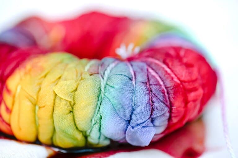
The best tie-dye color combination is usually made of two primary colors. They look awesome together especially when they spill over and blend into one another creating a new color in between them. The best primary color combinations and resulting secondary colors at the borders are:
- Red and blue – creates purple
- Red and yellow – creates orange
- Blue and yellow – creates green
- Fuschia and yellow – creates orange
- Yellow and turquoise – creates green
- Turquoise and fuschia – creates purple
You can create hundreds of colors by mixing any two primary colors in different quantities. Yellow and turquoise, for example, give you green. But what shade of green?
50% yellow and 50% turquoise gets you emerald green. If you wanted a slightly darker green like aventurine green, you would reduce yellow to 40% and increase turquoise to 60%. Or 20% yellow and 80% turquoise for an even darker green like amazonite, and so on.
2. A Primary Color And Secondary Color
Another beautiful combination is a primary color and a secondary color, though be warned, not all of them work well together.
You can obtain various colors depending on how saturated one primary color is. For instance, red plus blue gives you purple at the border. Adding more red or blue to the purple produces various shades of purple.
These are the workable primary plus secondary color combinations that look good side by side and mixed:
- Red and purple – burgundy or magenta edges
- Blue and pink – pastel shade of purple
- Yellow and green – green like lime green, apple green, or chartreuse
- Orange – amber when mixed with yellow and vermillion if mixed with red
- Blue and green – turquoise and teal
3. Multicolored Tie-Dye Color Combinations
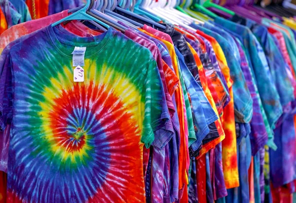
If you want to go all out with colors, nothing is stopping you. Multicolored tie-dye color combos particularly look awesome with the classic spiral technique. The traditional rainbow tie-dye combination is always a fun choice. You do not even need all the seven colors if they are not available.
The three primary colors, red, blue, and yellow, bleeding into each other creates the orange, green, and violet in between the borders. You must ensure that you follow the real rainbow color arrangements to get a similar effect and not combine the colors randomly.
But the rainbow may be too obvious for some folks. You can opt to go with the following psychedelic colors combinations instead for a colorful explosion. These are highly contrasting colors, usually five or more.
- Fuschia + Yellow + Green + Turquoise + Blue
- Yellow + Red + Purple + Blue + Green
Another surefire multicolor tie-dye option is adjacent colors in the color wheel. They are particularly great for theme colors. You can decide to go warm with bright hot summer colors, or a cool calm ocean theme.
You can incorporate neutrals like black, grey, and even shades of brown for certain themes like spring or fall, or tone down bright colors to create balance. Here are some popular theme color ideas:
- Red – Amber – Fuschia
- Yellow – Green – Blue
- Blue – Purple – Fuschia
- Fuschia – Purple – Turquoise
- Pink – Purple – Burgundy
- Green -Yellow – Turquoise
- Black – Fuschia – Red
- Blue – Navy -Black
- Purple – Navy – Black
- Lilac -Purple – Grey
- Black -Grey – Pink
- Green – Yellow – Brown
- Blue – Grey – Brown
- Blue – Teal -Brown
- Brown – Amber – Yellow
- Amber – Fuschia – Grey
Tie-Dye Color Combinations To Avoid
There are no bad combinations when it comes to tie-dying if you don’t mind brown. Every combination is unique and interesting. It’s all about placement and control.
Learning how to control the spread of dyes while placing them can make any combination eye-catching. Notwithstanding, spillovers are almost inevitable. As a result, you should beware of the colors that don’t combine into other interesting colors as anticipated. Which colors are these?
1. Three Primary Colors
Primary colors will only look good when adjacent to each other such that every border is made up of only two colors. However, any part that has all three primary colors combined together turns brown.
- Red, + blue + yellow = brown
- Fuschia + turquoise + yellow = brown
2. Two Secondary Colors
Any two secondary colors combined together make brown.
- Orange + green = brown
- Orange + purple = brown
- Green + purple = brown
3. Complementary Colors
Complementary colors are the colors opposite each other in the color wheel. One is a primary color and another a secondary color.
This is a highly contrasting combination when the two colors are placed side by side and make a really vibrant tie-dye. But the two dyes combined turn brown. So any spillover will brown the border of the two colors and may not be the outcome you hoped for.
- Red + green = brown
- Yellow + purple = brown
- Blue + orange = brown
More Tie-Dye Color Combination Tips
Besides learning color theory, other factors can help or hurt your tie-dye color combinations and expected results. Here are more tips for guaranteed success with tie-dye colors.
- Choose the right fabric. 100% natural cotton t-shirts or other apparel; scarf, tablecloths, curtain, tote bag, etc. Natural cotton fibers retain the most dye and yield vibrant colors. Other natural fibers like bamboo dye well too.
- Use the right type of dye for the project, especially if you opt to tie-dye a synthetic fiber like polyester. You’ll need a disperse dye for that. Fiber reactive dyes and all-purpose dyes are more commonly used for natural fibers and blends.
- You only need four colors to create any combination you want; the three primary colors and black. These must be pure dyes to combine successfully. If you couldn’t be bothered to go through the hassle of mixing dyes to get different colors, there are plenty of premixed dyes which are the majority in the market. Unfortunately, these don’t combine well, since they are already a mixture of colors themselves. You might get results that are below your expectations, so it is better to buy each color you need.
- Make swatches and label them before you embark on your project. This way, you’ll have an idea of how the colors will turn out when merged and a color reference point.
- Dampen your t-shirt before tying and dying it. Dry fibers do not absorb dyes as readily and deeply as wet fibers do.
- Learn how to place dyes without them comingling too much. This way, you can create any color scheme or theme without unwanted color surprises.
- Squirt adequate dye to get deeper into the folds and pleats for a more saturated and well-defined design. When the dye is only superficial and doesn’t soak through far enough, you not only end up with less intense colors but also huge white patches and a weak pattern.
People are drawn to colors differently and what appeals to one person may not appeal to you. So there are no best tie-dye combinations or bad ones. Just popular ones.
Whatever colors you think look beautiful together probably do. Well, except when it turns out contrary to how you intended by dyes overlapping to where they are not wanted, creating dull colors.
Therefore, mastering color theory and dye placement is key to achieving the best color combinations. Feel at liberty to experiment starting with two primary colors and adding more as you go. Happy tie-dying!
For more color combo inspiration, check out this video by Onyx Art Studios!
Up Next: Can You Tie-Dye A Shirt Twice?


